
- What fraction of children are in the right car seat?
- What is a guess that is too low?
- What is a guess that is too high?
- What is your best guess?
- How could the infographic be improved to be more precise?
- Why would this better show 1/4?
What I hope happens is an opportunity for students to use Math Practice 3 and Math Practice 6 among others. Personally I feel that while the infographics are eye-catching, they don’t clearly explain what fraction of people they are talking about. For example, while the actual fraction of children should always be the same, it doesn’t appear to be the same on the infographics. I hope that this causes students to have discussions around making sense of what information the infographics convey.
Here is my take on each of the infographics and what students might tell you:
- Bottle
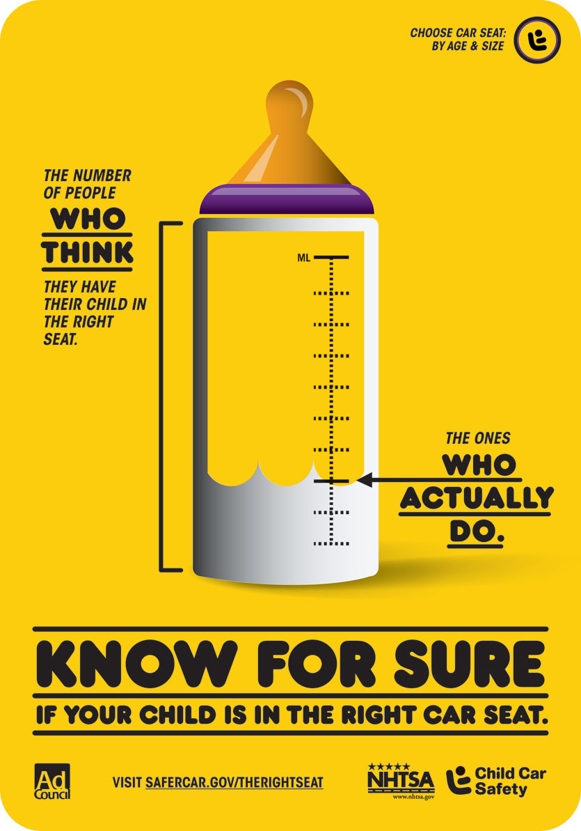
The milk appears to be going up 2/9 of the bottle’s markings. However, if you add another marking at the bottom, you get 3/10. If you add an additional marking at the top, you get 3/11. Students might also notice the sections are not equally spaced out. For example most sections have five dots between them while the top section has at least six dots.
- Stacking Toy
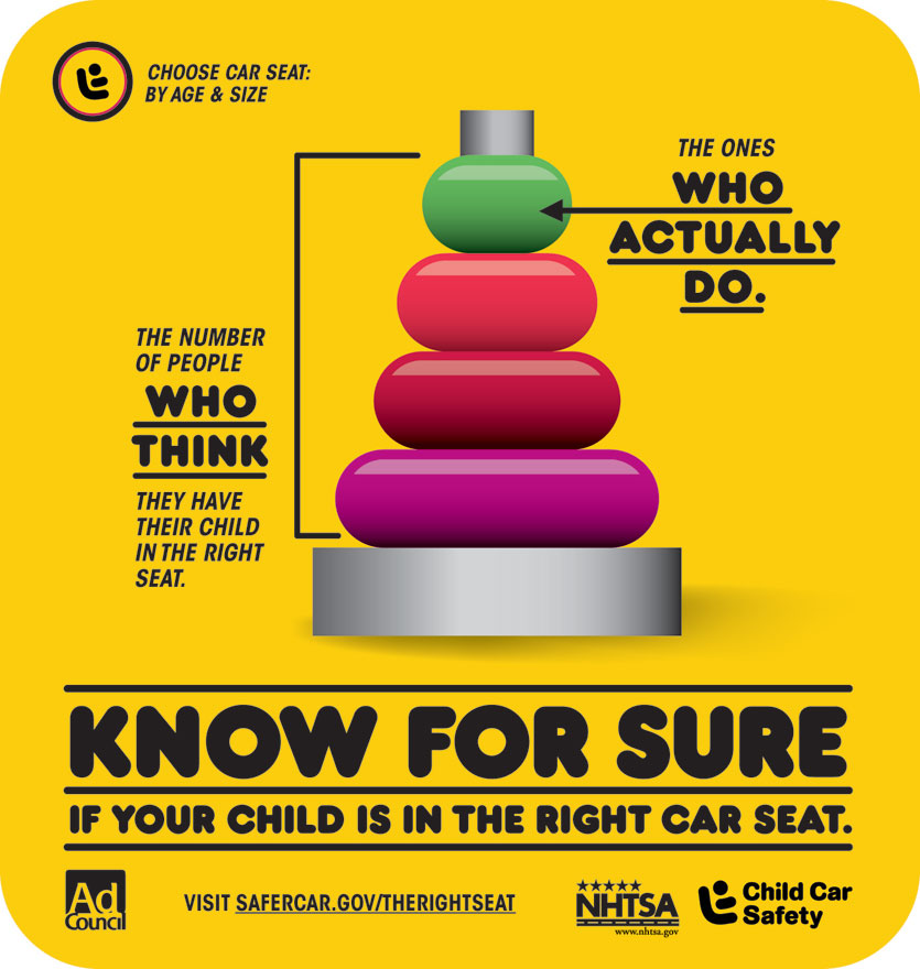
The most likely answer may be 1/4 but that would be assuming a linear (1/4 of the way up) or set (1 out of 4 rings) model where only the height or quantity mattered and not the 2D area of the ring. For example, the top ring is about half the size of the bottom ring so if you were taking total area into account, 1/4 would be too small.
- Pencil
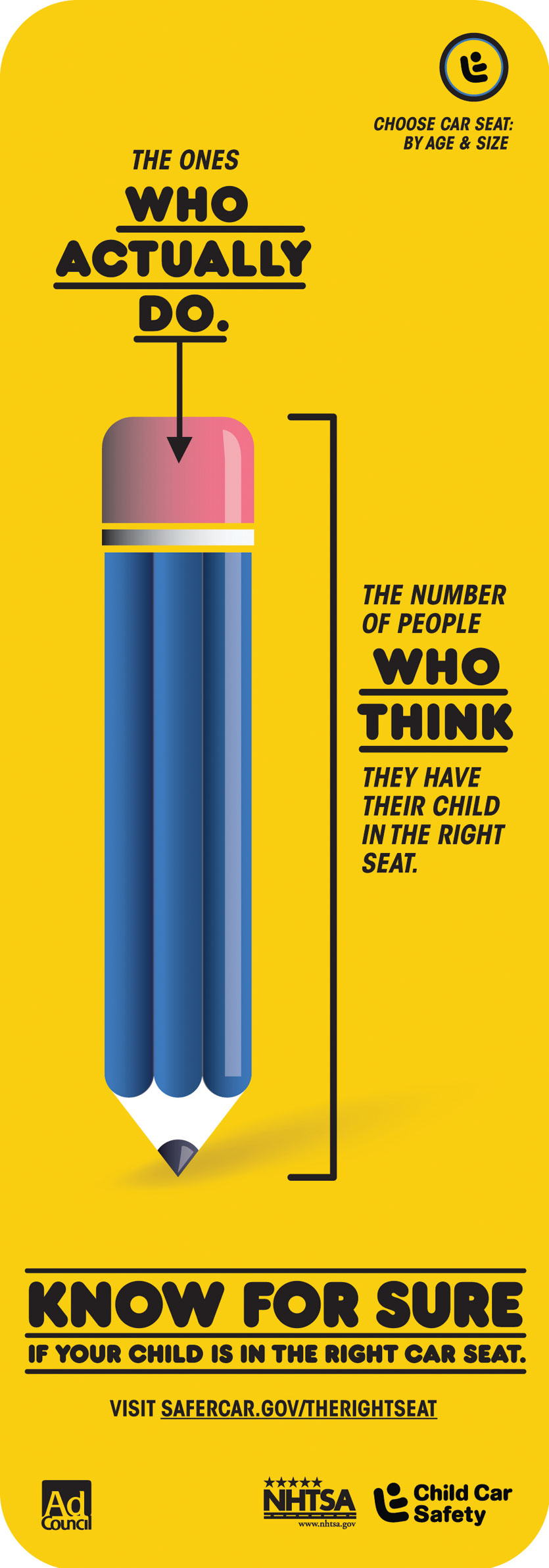
Using a ruler, it appears that the pencil’s eraser is approximately 2/13 of the entire pencil. Maybe students will say 1/3 if the pencil is one of three parts.
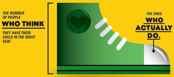
- Sneaker
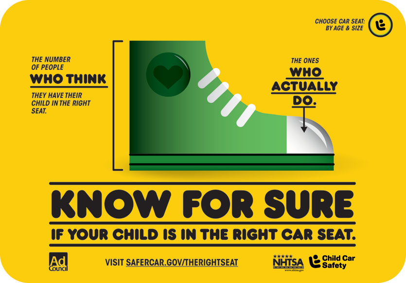
This one is probably the least clear. If you go by height of the shoe at the white toe portion over height of the total shoe, you get roughly 2/5.
- Popsicle
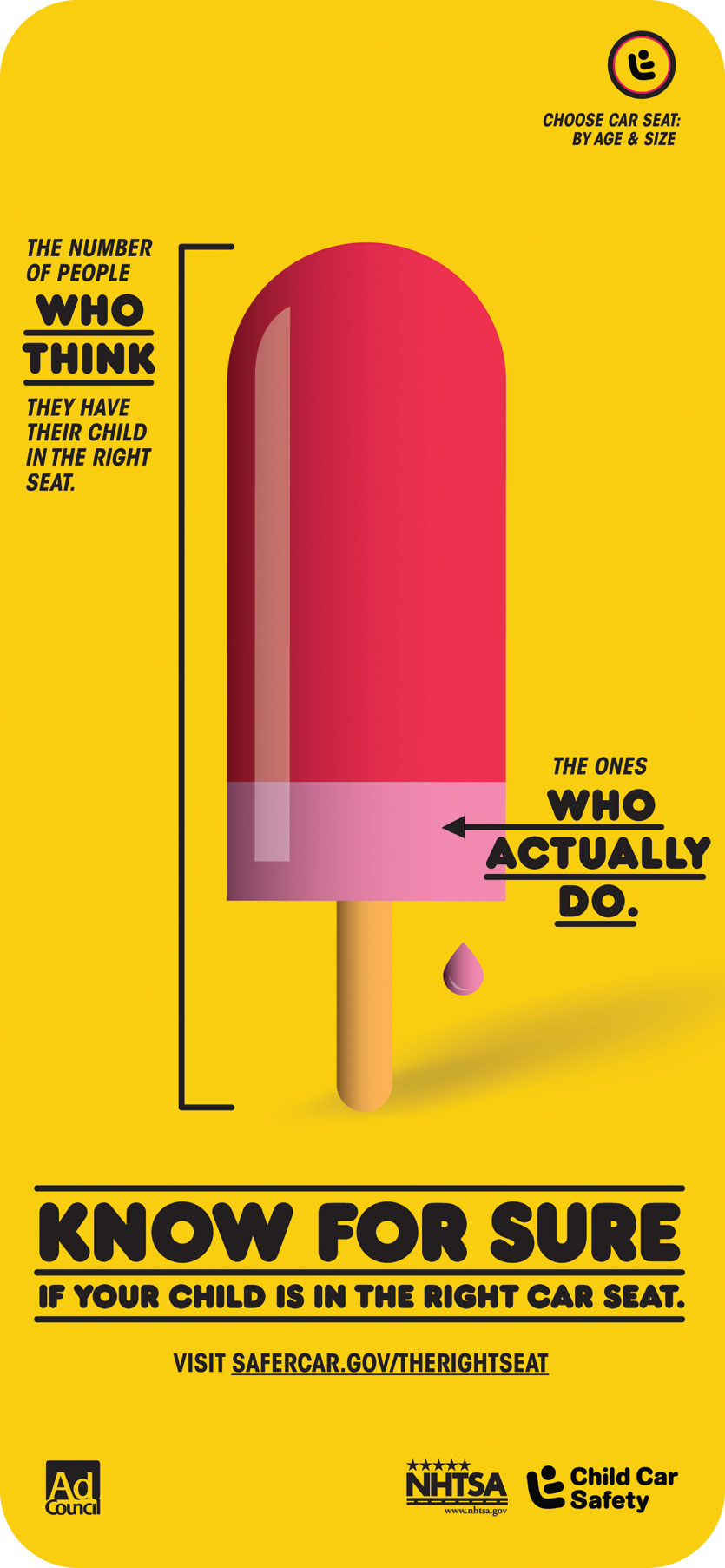
This one is also a little strange. It looks like the pink section of the popsicle is 3/20 of the entire popsicle including the stick (since the line goes to the bottom). However, if you assume that the stick should not be included and only the edible portion of the popsicle, you get a fraction closer to 1/5.
Once each group has had a chance to present what they believe to be the fraction of children in the right car seat, show them the image below (the complete PDF document is included in the “Download files” link). The NHTSA states in their Talking Points document:
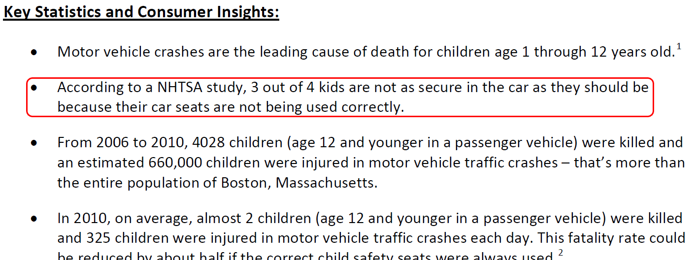
Students may at first think that the answer should be 3/4. However it states that “3 out of 4 kids are not as secure in the car as they should be because their car seats are not being used correctly.” which means that means that the fraction of children in the right car seat is 1/4. Students will likely be trying to make sense of how that can be the right answer based on what they thought from the infographic. Use this opportunity to “critique the reasoning of others” and have students suggest fixes for their infographic including where the lines should be or how the picture should change. Then have them present their findings to the group including the answers to these questions:
- What was your original guess?
- How could the infographic be improved to be more precise?
- Why would this better show 1/4?
- CCSS 3.NF.1 Understand a fraction 1/b as the quantity formed by 1 part when a whole is partitioned into b equal parts; understand a fraction a/b as the quantity formed by a parts of size 1/b.
- CCSS 3.NF.2 Understand a fraction as a number on the number line; represent fractions on a number line diagram.
- CCSS 3.NF.3 Explain equivalence of fractions in special cases, and compare fractions by reasoning about their size.
- CCSS 4.NF.1 Explain why a fraction a/b is equivalent to a fraction (n × a)/(n × b) by using visual fraction models, with attention to how the number and size of the parts differ even though the two fractions themselves are the same size. Use this principle to recognize and generate equivalent fractions.
- CCSS 4.NF.2 Compare two fractions with different numerators and different denominators, e.g., by creating common denominators or numerators, or by comparing to a benchmark fraction such as 1/2. Recognize that comparisons are valid only when the two fractions refer to the same whole. Record the results of comparisons with symbols >, =, or <, and justify the conclusions, e.g., by using a visual fraction model.
Just one extra thought: The infographic states “The number of people who think they have their child in the right seat”.
What about “The people who don’t think they have their child in the right seat”
Is the implication that EVERYONE thinks they have their child in the right seat, or are there actually some people who aren’t sure if they have their child in the right seat or not?
Definitely lots of wonderings that come out of these images.
Robert,
I don’t know that we can equate the number of children whose car seats are “not being used correctly” with the number of children that are “not in the right car seat” which could account for part of the discrepancy between the numbers presented and the infographic. Additionally, one is a measurement of adults and the other is a measurement of children. Considering multi-child families and the variety of combinations of parents and children in families (single parents versus pairs) could further contribute to the apparent discrepancy between the infographics and the 3/4 statement. But as a secondary teacher, I don’t know how young you could have that conversation without losing your students.
I’m pretty sure you meant “1/4 would be too large” rather than “small” in the rings infographic. If the rings volume is meant, then the smallest ring is less than 1/4 of the total volume since it is one of four rings but the ring of least volume. I wonder if there’s a connection here to standards about manipulating statistics? When you present an infographic that can be misinterpreted easily, but the misinterpretation(s) are predominantly in your favor, I think there’s an element of manipulation happening. “If the correct statistic is 1/4, why do you think they chose the smallest ring to represent 1/4 rather than the largest? How does this use of ambiguity serve the author’s purpose? Do the ways we present mathematics matter?”
Thank you for your meaningful tasks! You’re resources are in the top three I recommend to staff in my district both as classroom materials and where to start for PD!